Tuesday 24 March 2015

Vintage project evaluation

The era I have chosen for the vintage project is the 1950s. I have chosen this era because it wasn’t popular among other people in the class and there are many events that took place that interest me in the decade, such as the cold war and the atomic age that had started. I wanted to explore more about the films and comics industries from the 1950s and the red scare.
I researched both images and info for every page I did, including dates, context, etc.  Towards the end of my sketchbook I started to focus on more obscure subjects such as horror comics, movies, artists and popular technology of the time. These I felt I could explore with more enthusiasm so left them until the end to help me anticipate finishing the sketchbook.
The main cultural references in my era are focused on the rock and roll era and the fashion and hairstyles that were present in the decade. I have also focused on the then fully active cold war between the US and Russia and the repercussions of their conflicts.
Artists I studied in my sketchbook are Jackson Pollock, Mark Rothko and Willem De Kooning. The main art movement in the era was Abstract Expressionism and cubism. I think that the age of impressionism had become very old in its style and relevance in the 1950s and with cubism, abstract and other forms of expressionism becoming popular, artists had started to paint much more simply.
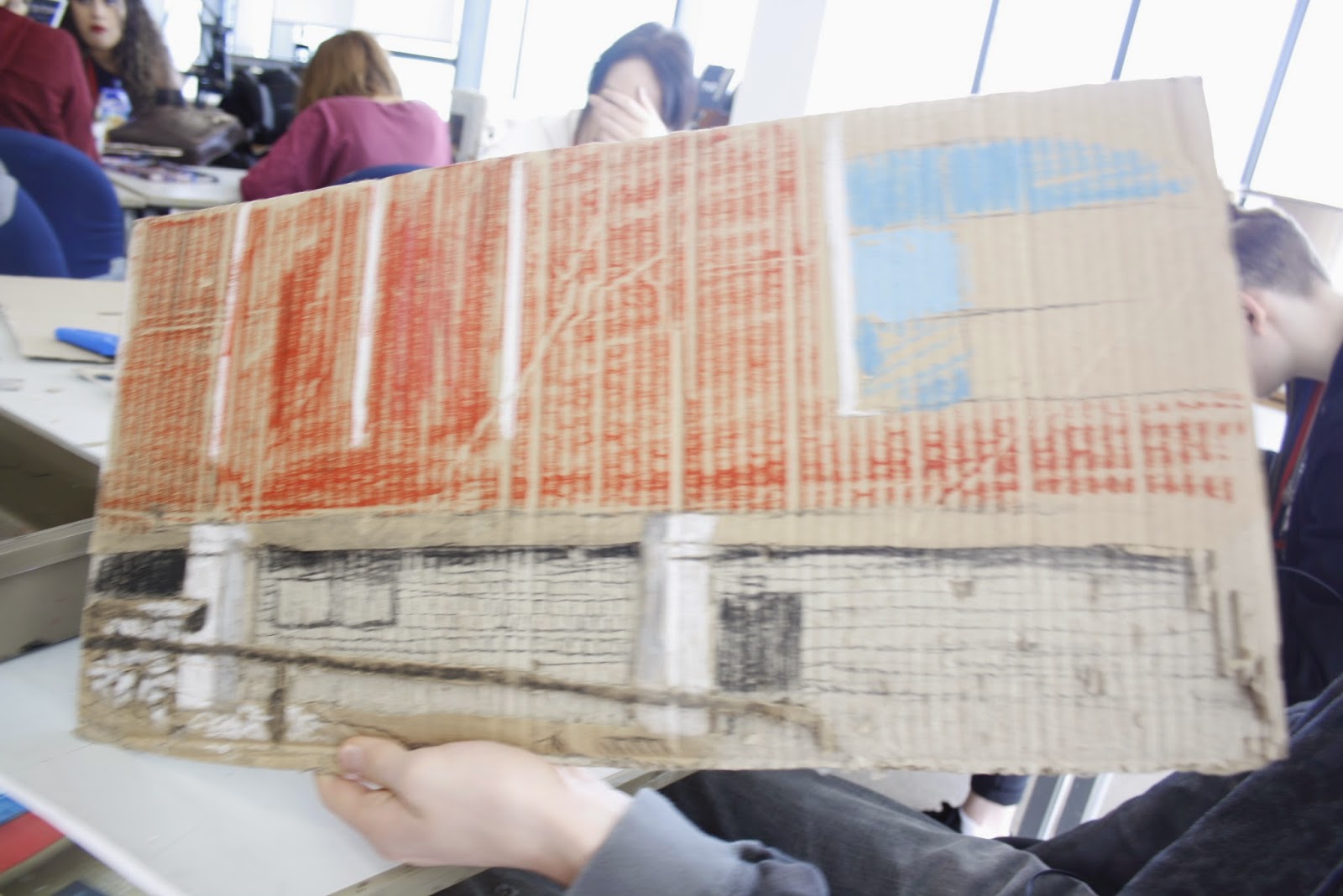
I have used a wide variety of media in my sketchbook including brush pens, pencil, acrylic paint, oil pastels, coloured pencil, marker pen, pro markers and water colour paints. I used brush pens to replicate a comic book effect, the acrylic paint splattered on the page to replicate Jackson Pollock’s style and pencil to achieve the best detail in studies of people or scenery for examples.
The annotations’ positions could have been more creative in how I added them alongside the drawings. I wrote them close to the images on the pages.
In hindsight, I could have managed my time a lot better, often having to rush because of taking too long on certain pages. To improve I could have studied more relevant subjects, for example, maybe cut out the page on toys, and definitely included more sketches on pages like movies and hairstyles.

 I am happy with the final outcome of my sketchbook and despite the problems mentioned before, I am proud of how some of the sketches have turned out and could be some of my best.

Experimental Portrait Project Evaluation

I decided to produce a portrait of one of my peers (Kieron Pickering) for this project because I found it more productive to take photos as well as being more challenging.
I looked at the artists, Francis Bacon, Pablo Picasso and Magi Hambling. Francis Bacon has always appealed to me, being one of my favourite artists due to his dark and twisted style, so he was an easy choice when deciding on three artists to study. I have always known about Pablo Picasso and his cubism style, so I chose him to help add variety with my choice. I chose Maggi Hambling because her sketching style is similar to mine and appealed to me.
The media I used was very varied, for the two mood boards on Kieron and the artists sheet, I used brush pens, oil pastels, biro, pencil, sgraffitto, charcoal and chalk. For the final piece I used collage and ink on the background also.
I feel that my mood boards turned out fine in general; with the exception of one (one of the two on Kieron) of which looks rushed in places. However, the medias I have chosen work well together.
My final piece is comprised of pencil, acrylic paint and collaged images over ink background. I think it is effective because it mixes both detailed sketching of the head and the roughly painted shirt very well. The collaged images ( of what Kieron is interested in ) and small photos of him help give the background more depth, crowding it and making it seem less desolate.
I feel I have improved my experimental drawing skills because I have tried lots of different techniques drawing pictures of the same thing. 
I think that although I was behind by the end, I didn’t manage my time as poorly as other projects. It was referred with one mood board and the background of my final piece to be completed.
Within the time frame I could have produced better work although I am satisfied with what I have done.
 The project has helped me I think with using different media in my work, as well as improve my skills of drawing faces.

Tuesday 17 March 2015

cardboard city - Christian Boltanski

French sculptor, photographer, painter and filmmaker. Self-taught, he began painting in 1958 but first came to public attention in the late 1960s with short films and with the publication of notebooks in which he came to terms with his childhood. The combination in these works of real and fictional evidence of his and other people's existence remained central to his later art.
In the 1970 s photography became Boltanski's favourite medium for exploring forms of remembering and consciousness, reconstructed in pictorial terms. In the early 1980 s Boltanski ceased using objects trouvés as a point of departure. Instead he produced 'theatrical compositions' by fashioning small marionette-like figures from cardboard, scraps of materials, thread and cork, painted in colour and transposed photographically into large picture formats. These led to kinetic installations in which a strong light focused on figurative shapes helped create a mysterious environment of silhouettes in movement.


In 1986 Boltanski began making installations from a variety of materials and media, with light effects as integral components. Such works, for which he used portrait photographs of Jewish schoolchildren taken in Vienna in 1931, serve as a forceful reminder of the mass murder of Jews by the Nazis. In the works that followed Boltanski filled whole rooms and corridors with items of worn clothing as a way of prompting an involuntary association with the clothing depots at concentration camps. As in his previous work, objects thus serve as mute testimony to human experience and suffering.

I am very fond of Boltanski's work as I find it eerie and skeletal. The Theatre des Ombres reminds me of a tribal painting scene but with a contemporary twist involved.


http://classconnection.s3.amazonaws.com/135/flashcards/908135/png/cboltanski-shadows1330304010103.png


http://floresenelatico.es/wp-content/uploads/2011/11/Boltanski_2.jpg


http://www.moma.org/collection_images/resized/229/w155h170crop/CRI_180229.jpg


https://s-media-cache-ak0.pinimg.com/736x/2c/70/dd/2c70dde2176471122e2e6ec4793640f3.jpg


cardboard city - college recreation

Here are some photos of me recreating a photo of barnsley college in cardboard. I have added depth to it by cutting out the parts most farthest away to bring the fore ground to the front. I coloured it using oil pastels, chalk and charcoal.


cardboard city - construction

Here are my photos of the cardboard city activity the class did and how me and my group achieved what we did. Using only unfolded boxes, i created cubes and stacked them in the form of a fort in the corner of the room. we also made cardboard armour and fake turrets out of the same materials.